
This is part three of the FeatureCat Diaries-series. FeatureCat is a feature- and feedback management SaaS I am building in public. This is a sort of Captain’s log, where I am rambling about my progress.
The general cadence for YouTubers is to be fairly consistent, then disappear for a while, followed by an “Update” video, where they explain what happened and why they disappeared for a while.
This is such an update.
When I set out to work on FeatureCat last year, I had quite the ambitious roadmap in my mind. I wanted to launch early, get feedback quickly (after all, it is a product centered around user feedback), and iterate from there-on.
Launching a publicly available version I did, some feedback I got, but the effort to get FeatureCat in front of people never materialized.
The reasons for this are manyfold, but fall roughly in two categories: 1) my time was constrained, as we had a lovely addition to the family 👶, and I got an awesome new job. No complaints here.
Category 2), which was much more of a personal misjudgment on my side, was (and is) the modus operandi of every indie hacker out there: I’m much more of a builder, than a marketer. So as the story goes, this post will finish with me publishing the second major redesign, and no customers.
At least you, the reader, will be up to speed, and I will (hopefully) have learned a lesson. And as such, the Youtuber’s update spiel is complete. Until the next time where I don’t write anything for months and we’ll do it all over again.
But for now, let’s get into it. We’re starting in the summer - of 2021.
May 2021: It’s alive
FeatureCat is alive and well. Feedback slowly rolling in and I want to move to more users as quickly as possible. That’s what I originally called the closed beta, where I would invite other likeminded iOS developers to test out the product. While the public boards already work, the admin panel is still very rudimentary (rails scaffolds all the way), and FeatureCat has no notion of multiple tenants and admins. So that is the highest priority right now: get the app to a state where it supports multiple tenants (accounts) and admins (admin accounts per organization).
In Rails-land, that is achievable in a variety of ways, but I’ll go with the popular kids: devise for user management and acts_as_tentant for multi-tenant.
June 2021 : High-touch vs. low-touch
How prospects become customers is an interesting question in itself, with effects on user management and sign-ups. Stripe has a brilliant guide on SaaS-business by the ever prolific Patrick McKenzie that discusses a lot of fundamentals, including the distinction between low-touch and high-touch SaaS businesses. I’d recommend reading the entire article, but two key differentiators are how the product is sold and what the average contract volumes are.
High-touch is a company like Salesforce or SAP on the extreme end. Nobody just signs up for an SAP account. It requires a long sales period, lots of negotiation and sometimes years of integration, training and onboarding before a user can forget that one transaction code while staring at a UI from the sixties.
On the low-touch side you might find a company like Slack. Someone signs up, enters a credit card, and they are off to the races.
What does that mean for FeatureCat? I would position myself squarely in the low-touch corner. Signing up is publicly available with a free trial and any developer can integrate the public boards on the customer’s website or in their app. Ideally I don’t have to be involved with onboarding at all, except in edge cases where the customer does not have any access to developers in-house (for which I might charge a set-up fee).
That has a variety of consequences for sales and onboarding. While I will have to do active (outbound) sales, if I do my job, the majority of sales should be inbound, driven by 1) SEO & content marketing, 2) word of mouth and active community engagement and 3) advertisement in relevant spaces. On the product side, the onboarding process needs to be so refined and the documentation so comprehensive, customers should rarely require my assistance. Instead, the product has to do the heavy lifting.
I added a multi-step onboarding flow, powered by the awesome wicked gem, and will also create some accompanying documentation - see further down below.
July 2021: Post-scaffold world
Remember that second redesign I mentioned in the intro? This would be the first, where I move on from the basic scaffold-y list views to a two-column view. I always really enjoyed workspaces like e.g. Google Mail, where there is a list view on the left and a detail view on the right: all features on the left and a single feature on the right. For sake of comparison, you can then easily jump between multiple entries.

Rails makes all basic web interactions with entities super easy: viewing lists, viewing single items, creating and updating items - but combining all these into mixed views breaks basic REST conventions.
This is also one of the reasons why (later on) this design did not survive: it added so much complexity to each view that it slowed down development massively. In addition, there is a perfectly good reason the REST terminology has taken hold: it just works. The benefit of having both list and detail views on the same page was fairly low for this case. Plus, having full-width index and detail views also allows both to be more expansive and show more of the information you actually need.
It was a worthwhile exploration, but certainly also contributed to 1) slowing down development during the two-pane time and 2) removing it again was heavy time investment. More on that below.
September 2021: Closed beta
With a tool that has user feedback at its core, getting user feedback for it was obviously of significance. So what is a indie hacker to do to get their first customers? @shl certainly has an opinion: you need to the first 100, one by one. And he’s probably right.
I built a long spreadsheet with potential users, created personalized introduction messages and sent a whole lot of emails, messages and DMs. The goal was not to get immediate customers (fairly unlikely with a cold lead anyway), but gather some initial interest for early users. The response was quite muted in single digit percentage, but likely in line with what you would expect with outreach like that. I also got a few users who signed up via a simple Google Form on the website.
To 100 I did not get (yet), but I did get a handful of iOS developers to give it a spin, which was lovely. And while FeatureCat is certainly a long way from being truly self-serve, I did learn quite a lot on where I have to streamline onboarding, provide documentation and the like.
December 2021: Billing
So I created my first plan: a basic $20/month indie plan, with an alternative $100/year launch offer. The plan is limited to one product to get feedback for, and one team member - because the app simply doesn’t support a team yet. This plan will mostly act as a placeholder for the “silent launch”.
I built the integration using the amazing pay gem, which was fairly straightforward. Billing can be a topic with unlimited complexity, but for now I just need to be able to charge a credit card and have a way to manage subscriptions. I’ll worry about the rest later.
January 2022: Public website
While the first users will surely need active courting, a self-serve SaaS needs discoverability. People find software on the internet in a variety of ways, but one of them will invariably be Google. To be discoverable on Google means 1) having a web property (i.e. website) to link to in the first place, 2) having content that people might search for and 3) optimizing the property and its content for search engines.
Content marketing, as in writing e.g. a blog as an additional avenue of discovery, will come further down the road. For now I need to make sure that the website exists in the first place, and that it actually converts and leads to sign-ups.
Good conversion is a completely separate topic as well. For now, I’ll make sure the home page does a decent job of explaining the Why’s, How’s and What’s, including a short video walkthrough as a ‘virtual demo’.
Check it out - I’m quite proud of it.
February 2022: Docs
A self-serve SaaS, especially one that requires to be integrated with at least a few code snippets, needs documentation. There are lots of ways to solve for that, but the usual approach I’ve seen would be to have an 1) onboarding flow in the app after sign-up that guides the user through the basics, 2) link to external documentation in relevant places inside the app, and 3) a separate web property on which the external documentation is hosted. I already have a light onboarding flow, but still need a place to put documentation.
There are endless simple ways to accomplish this: simply host a Google Doc and link to the relevant headings, set up something like a Notion site to put documentation, use an actual Helpdesk tool with a knowledge base, or just add these as articles to the existing Jekyll website. I chose none of these, only for the reason that I thought it would be fun to build it myself. (You can see how “builder” decisions like this might impact development speed.)
I built a new Jekyll theme to host the documentation on a subdomain of FeatureCat, with custom UI, Javascript-powered static site search, and built-in configurability to open source it at some point. I’m actually quite proud of it.1

I also added some basic documentation and guides for integrating FeatureCat into your product. There are a few additional articles I want to add - the rest should be driven by support and people asking questions.
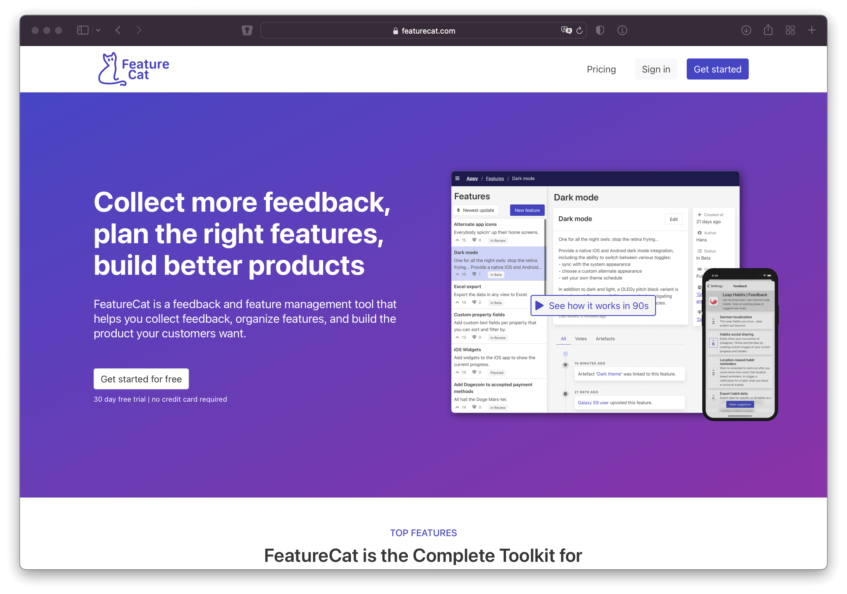
July 2022: Redesign (again)
Remember that second redesign I talked about earlier? The two-column view had to go. It added too much complexity on the technical side without a lot of upside in user experience.
It actually came with real downsides: The list views (e.g. showing all features or users) had a fairly low density. Since the list view would only ever take up less than half of the available space, individual items needed to be multi-line to provide actually useful information. That meant a lot of scrolling without a strong horizontal anchor - because they were no actual columns.
Boring old tables in list views work. They are not exciting, but tremendously useful.

A similar issue came up in the detail view: any entity’s detail view had to share the screen with the list view, which limited the amount of information you could display. Now, every entity gets its own two-column view to display both its own data and linked items (e.g. details about a feature on the left, and all votes and linked artifacts on the right). This also leaves a lot more room for future expansion.

Two major redesigns before an actual public launch are certainly not ideal. In this case the issue was rather that the first redesign took FeatureCat from draft (i.e. rails scaffold) to what I thought would work great, while the second redesign was realizing the first actually didn’t work in a variety of ways. Maybe I’ll just start calling it design explorations instead…
August 2022: Public board 2.0
In the late summer of 2022, it was time to play catch-up. So far the public board, where features where publicly available for authenticated users to vote on, was still in its first iteration. That meant a long, static list of features, without pagination, bad error handling and limited branding. The long list appeared in one column, which didn’t look great on on wider displays - or anything that wasn’t a mobile view.

So the public board got a massive upgrade. Users can now search already existing features, and sort the list to their liking. The default sorting actually is based on a trending algorithm, so that features that recently got attention rank a bit higher.2
The public board now looks decent on the web, with a separate column for new suggestions, which otherwise are buried in a modal. And I finally reworked the branding, which now differentiates between an accent and a brand color (for buttons and the header respectively), and calculates the text color on the fly to account for the lightness of the background. In addition, your app icon also now shows up as the favicon.

September 2022: Onwards
And would you look at that. We’re back up to speed, and truly leading up to the launch.
So what now? I have some final launch preparation to do (including one “probably don’t need it, just launch now”-feature, but I’m going to do it anyways), and will rework the subscription plans a bit. Then off we go. Don’t forget to like and subscribe!
-
This is the conundrum: I really enjoyed building it. It was and is a terrible business decision, because the time I spent on it could have easily been used for more important things when just going with some of the other solutions I outlined. But on the other hand, if I’m not enjoying myself here, what really is the point of a side project? ↩
-
The trending algorithm was quite an interesting challenge. There are a variety of ‘proper’ ways to do this, which usually all involve calculating a separate score on all features based on weighted parameters (e.g. total votes, votes in the last days, recency, etc.) and persisting/caching that somewhere. That felt a bit too heavy-handed to me, so I simply load the most recent votes alongside the features, match and count them per feature, and use that in combination with the total votes to calculate a trending score on the fly. ↩